Here are some examples of work I have done (click thumbnails below to enlarge )
Over the past few years, usage of smartphones and tablets to access the Internet has increased exponentially. Already, in some demographics, mobile Internet usage is surpassing that of desktop Internet usage.
This brings up the question of how to build websites suitable for all users. The industry responded by coming up with responsive web design. This is the practice of building websites that will work on every device and every screen size, whether they are large or small, mobile or desktop.
Responsive web designing is the future of web design. Not a single website can gain the attention of customers using smartphones or tablets to access internet, unless it is made in a responsive manner.
However, many websites are still made using "static" HTML, rather than responsive HTML coding, and they look like the examples below.

Example of a website using responsive design, adapting to each display
In the above illustration, you can see how the same website created with responsive design appears on a desktop display (landscape), and a smartphone and tablet (portrait).
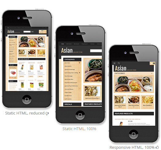
Does your website look like a postage stamp on a smartphone? If so, it was made with static HTML (the outdated code still used on many sites) which means it will be reduced to fit the width of the mobile device (left example, reduced ).
As these websites were made with large desktop or laptop computer displays in mind, they are often reduced beyond the point of legibility. In order to view sites like the examples, you have to zoom in, and then pan around the page just to read the content (middle example, zoomed to 100%).
This is far from an ideal viewing experience, and upon encountering websites employing outdated technology, many users will simply move on, and you have lost any chance to promote your products or services, etc.
The third example shows the same website using responsive HTML . Photos, graphics, and columns are automatically resized, text is automatically reflowed and resized, and menu items change into easily accessible pulldown menus

 Before coming to Japan, I worked in the design field, designing and creating signs for a variety of businesses, as well as handling the art direction of an entertainment magazine, and a high-tech related magazine in Victoria BC, Canada.
In Japan, over the years I have designed logos and signs for a variety of businesses, some of which you can see above.
I started doing website design in 1994, back when HTML was all coded in text editors by hand. A lot has changed since then, and with so many people accessing the Internet using smartphones and tablets, your website needs to be optimized for these devices. Please see below more information on "responsive HTML" (optimizing website layout for multiple platforms), and how I can bring your website up to current standards.
In the past I have done some 3D CG illustration, mostly architectural in nature, which relates to my woodworking which is more or less a hobby. I have constructed a number of wood decks and simple furniture for friends and family, and I carve signs (see my woodworking blog) now and then in my spare time.
I also studied log house building in Canada.
You can see a photo of a house I worked on at the B. Allan Mackie School of Log Building in 1999.
If you are interested in improving multi-device support for your website, and potentially attracting many more users, head on over to my CONTACT page and feel free to drop me a note.
Whether you are wanting to start up a new website from scratch, or redesign your existing web presence to offer better compatibility with the multitude of different devices accessing the Internet, I look forward to hearing from you.